
TLDR
- UX design structure gives digital products a clear foundation before visual details are added.
- Wireframes help teams review elements while the experience is still easy to adjust.
- A strong layout should work with real-world content, including longer copy, varied imagery, changing product details, and future campaigns.
- Grayscale reviews reveal if the structure is guiding the user without relying on design assets.
User experience (UX) represents how real people interact with a product, system, or service. It focuses on making tasks easy, useful, and enjoyable for the user while avoiding confusion or friction.
UX design structure is what helps a digital product work before the visual layer makes it feel finished. Before the custom graphics, final copy, and brand moments, we need a clear foundation for how people move through the experience, understand what they’re seeing, and know what to do next.
Strong design starts before conversations about brand colors and imagery. The planning, wireframing, spacing, hierarchy, flow, and proportion all build an experience that can stand on its own before the colors, images, and other design elements are added.
That early foundation is what helps a polished idea become something a team can keep using, improving, and building on over time.
What UX Design Structure Means
UX design structure is the organization beneath a digital experience. Think of it as the bones that support all the other elements: layout, hierarchy, navigation, spacing, content placement, user flow, and repeatable patterns.
Strong structure helps users understand where they are, what they are seeing, what matters most, and what step comes next. It also helps internal teams make better decisions because the experience has clear logic behind it.
That structure can be reviewed before a design looks polished. In fact, some of the most important product decisions happen when the design is still simple enough to question, test, and reshape.
"Ask yourself: could this visual communicate the message on its own, even with no content to lean on? That question is the foundation of intentional design."
- Dillon Johnson, Senior Designer
The Empty Room Test for Digital Product Design
Think about walking into a new-build home before anyone has moved in. The walls are primed, the rooms are empty, and there’s no furniture, paint colors, or family photos on the walls yet.
Even in that unfinished state, the structure tells you a lot. You can tell whether the kitchen connects to the living space in a useful way. You can imagine where the couch would go. You can see how light moves through the rooms. You can picture how people would live inside the space because the foundation gives everything a place to land.
That same idea applies to digital product design.
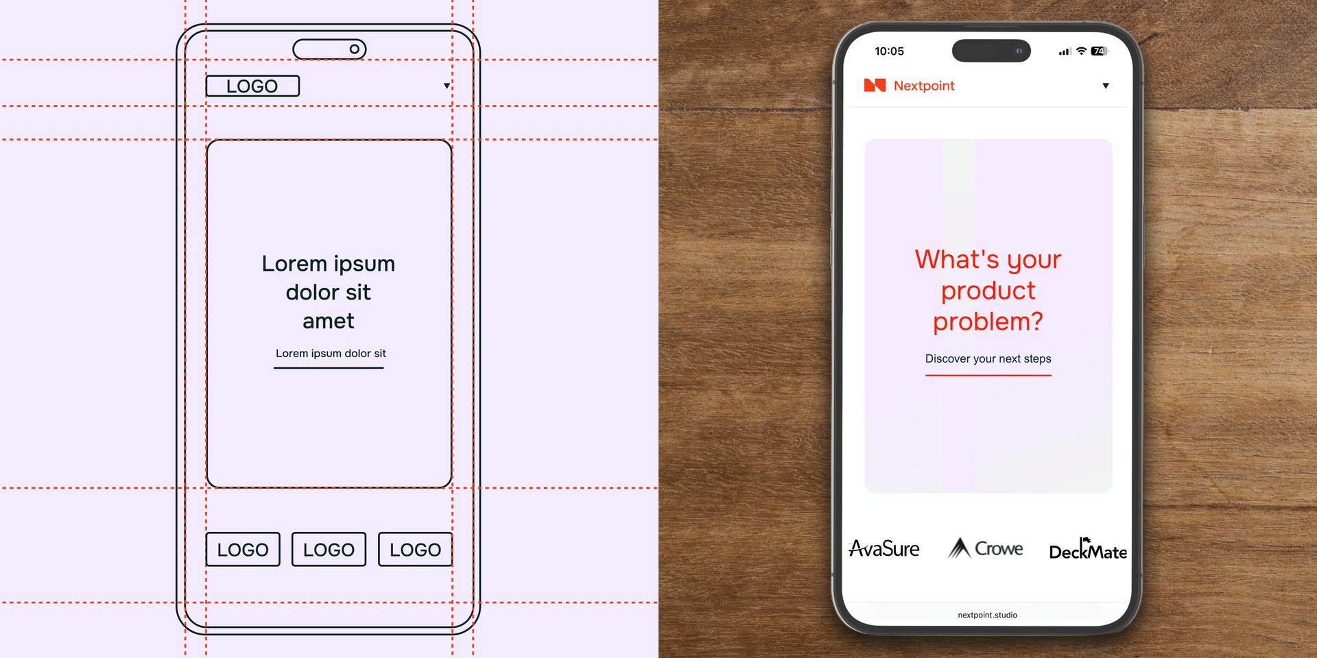
A website, app, platform, or portal should have an “empty room” version that still makes sense. When the images, icons, colors, and final copy are pulled back, the layout should still show what belongs where while the hierarchy guides attention and empowers people to understand where they are and what comes next.
When the empty version works, the finished version has a much stronger place to land. The visual layer can add personality, clarity, and polish because the structure underneath is already doing its job.
Why UX Design Strategy Is Important
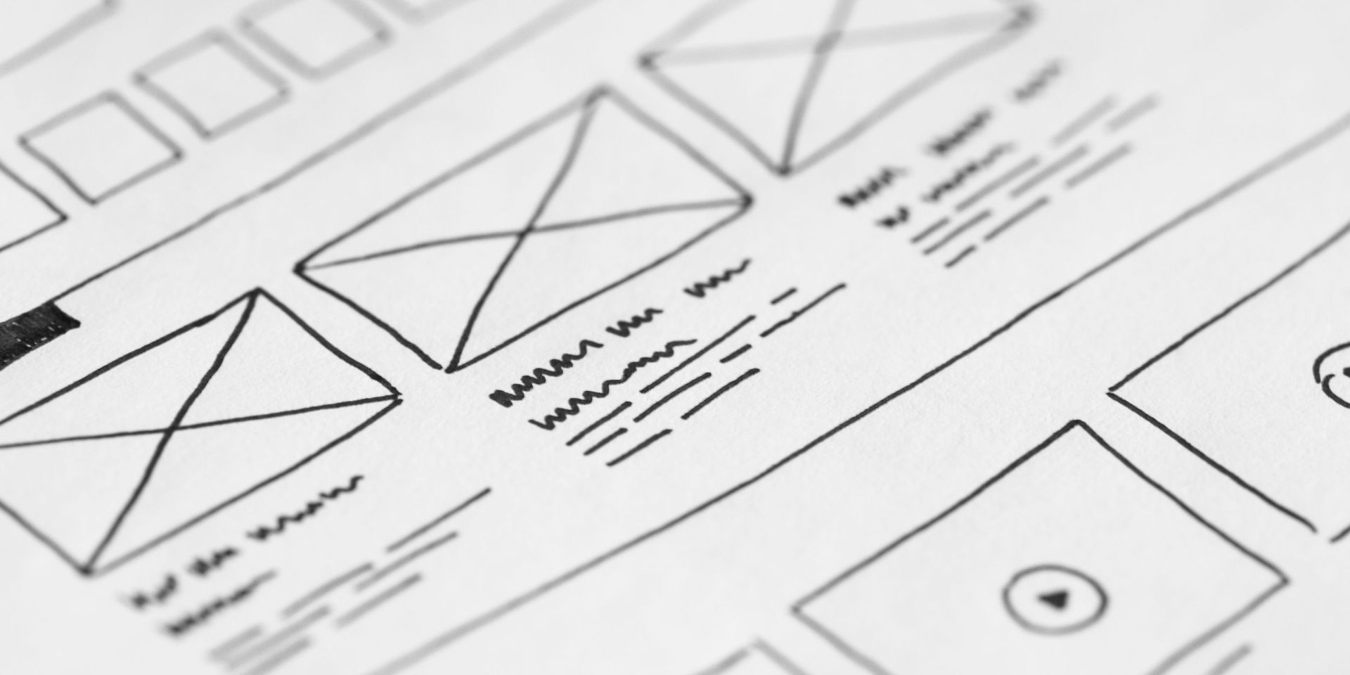
Wireframing in UX design gives teams a practical way to review layout, hierarchy, flow, and content placement before the product moves into a polished visual direction.
A wireframe shows how the experience is organized and helps the team see what users need to do, what content needs to support them, and where the product needs to create momentum.
It also reveals where the thinking still needs work.
A page may feel useful in a polished mockup because a strong hero image is carrying the experience. A layout may look balanced when combined with perfect sample content. In both cases, these experiences start to feel awkward once real copy, real images, and real product details begin shaping the page.
Before moving into high-fidelity design, teams can use wireframes to see those issues earlier and review:
- The primary job of each page or screen
- The user’s most likely next step
- The order of information on the page
- The placement and clarity of calls to action
- The way content supports the user’s decision
- The way the layout adapts across desktop, tablet, and mobile
- The places where future content, features, or campaigns may need to fit
Those conversations are easier before the design looks finished. Once a concept looks polished, teams naturally start operating on personal preference instead of evaluating its true effectiveness.
While design details are critically important, wireframes keep early feedback focused on how the experience works rather than how it feels or looks.

Strong UX Design Structure Gives Content Room to Work
Some digital layouts work beautifully in a controlled mockup, where every piece of content fits exactly as planned.
The headline is the right length, the hero image has the right crop, the product descriptions stay concise, and each item in a grid follows the same pattern. The design feels steady because the content is behaving exactly as expected.
Real digital products usually ask more of the structure. Copy gets longer. Images vary in quality, crop, and orientation. Product details change. New campaigns, pages, features, or audiences get added over time. A layout that only works under perfect conditions creates friction once the team uses it every day.
That’s why a strong UX design structure needs enough flexibility to support real content and change. It gives copy, imagery, product data, and future updates a dependable place to go without asking the team to rethink the entire experience with every shift.
This is especially important for growing companies because digital products rarely stay static. A website, platform, or app may need to support new campaigns, new audiences, expanded services, updated messaging, and more complex user paths as the business evolves.
Content-heavy products make this especially clear. Marketplaces, dashboards, media libraries, ecommerce pages, and social platforms all rely on repeatable patterns that can hold many different types of information.
The content may change constantly, but the underlying structure gives users consistency. They learn where the information they’re looking for lives, where actions they take most will appear, and how to move through the experience with confidence.
The Grayscale Review Shows What the Design Is Really Doing
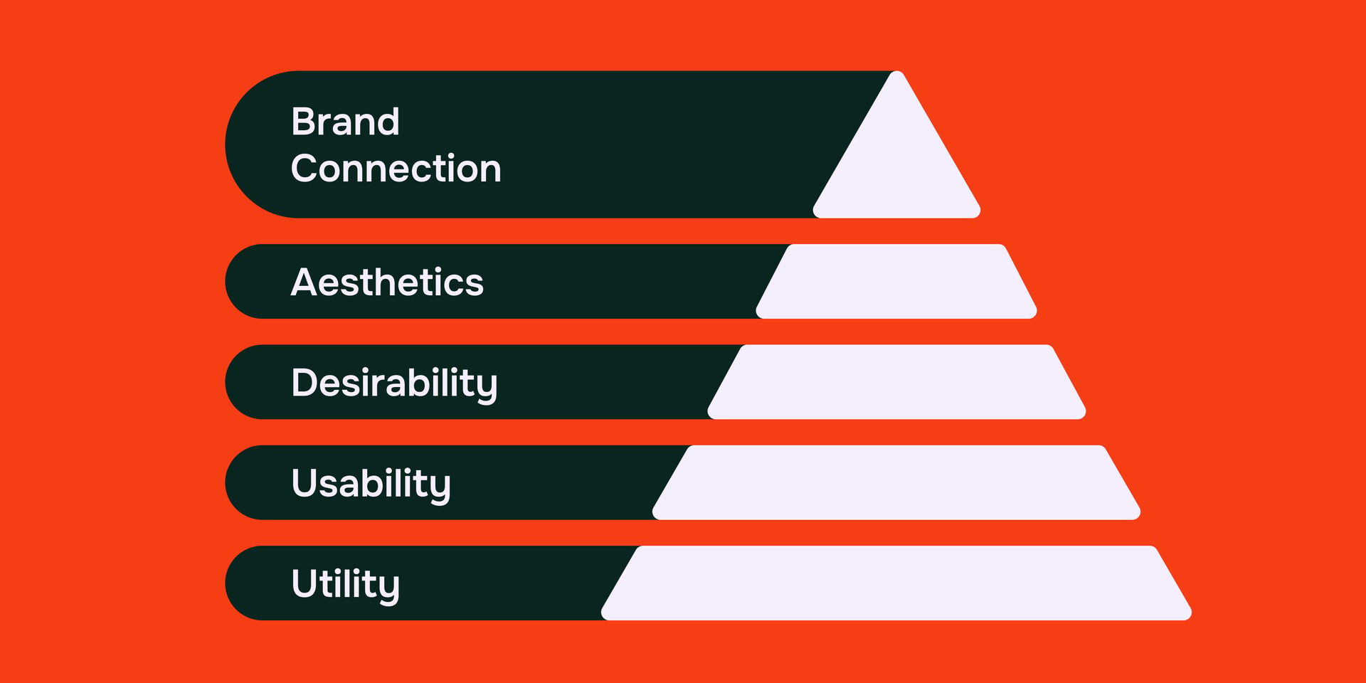
One way we can see the bones of a site more clearly (and test its structure) is to essentially remove the visual layer by graying it out. Turn images into gray box placeholders. Remove the color of design elements. Pull back the branded UI details. Use draft copy or basic labels.
When you strip away the photography, color, and final copy, the layout still needs to guide the user.
Airbnb is a useful example here because the user experience needs to work across thousands of very different listings. One card may feature a bright beachfront home with a lengthy description, another may show a small city apartment with only the required info, and another may show a rustic cabin with less than aesthetic imagery.
The content changes constantly, but the structure stays steady enough to support all of it. Users can still understand where each listing begins and ends, what information matters most, how the search experience is organized, and where the next action lives.
The interface doesn’t rely on beautiful imagery or graphics alone to make the experience feel usable. The hierarchy, spacing, rhythm, and flow are already doing meaningful work.
We bring this kind of thinking into early product conversations with clients because it helps teams focus on the foundation before getting too attached to the finish.
In grayscale or low-fidelity form, a product has to answer some important questions.
- Can users understand what they are looking at?
- Can they move through the experience without needing extra explanation?
- Does the layout still make sense when the most polished parts are temporarily removed?
We’ve seen the impact a good structure has in client work where a digital experience supports a lot of options without overwhelming the user. We helped create a digital builder for boat renovators in which users needed to move through visual selections for their boat's layout, seating, styling, accessories, and other choices in a way that felt simple enough to follow.
The visual design was obviously important, but the priority was helping people understand where they were in the process and what decision came next.
Visual design adds personality, emotion, and brand depth, but it works best when the structure underneath is already clear. When a layout holds up in grayscale, it gives the rest of the design a stronger place to land.
Structure Helps Teams Build from a Clearer Foundation
Small structural decisions shape how easy a product is to manage and grow later. A flexible template, clear navigation system, and thoughtful mobile pattern can make future updates feel more connected from the start. New features, campaigns, and pages have a clearer place to fit. The team has a shared foundation they can return to as the experience evolves.
A structure-first approach helps make that work easier across disciplines.
Designers can make layout decisions with more context. Developers can understand patterns earlier. Marketers can see where content needs to work. Leadership can review the experience through user goals and business goals, which keeps the conversation grounded in how the product needs to function.
That shared structure gives the team a better way to talk about the work. Instead of reacting only to how a design looks, everyone can review how the experience supports the people using it.
How to Build Better UX Design Structure Before Visual Design
A stronger foundation can help the process move more smoothly, because important decisions happen earlier.
Before moving into polished visuals, teams can review the experience by asking:
- What is the primary job of this page or screen?
- What does the user need to understand first?
- What next action should feel most natural?
- Does the hierarchy support that action?
- Does the layout work with real content?
- Can the structure support short copy, long copy, varied images, and changing product details?
- Does the pattern hold up across desktop, tablet, and mobile?
- Are there places where the design depends too heavily on color, imagery, or motion?
- Can future content, features, or campaigns fit into this structure without forcing a full redesign?
This kind of review gives the team a clearer foundation for future decisions as the product grows.
Good design bones give a product strength, shape, and flexibility. They help the experience support new content, features, campaigns, and user paths while keeping the product easier to understand and easier to improve.
Strong Digital Products Work Before They Look Finished
Building strong design starts with looking closely at the experience underneath the finished layer.
When the final imagery, polished copy, branded user interface (UI), motion, and visual details are pulled back, the product should still feel clear and intentional.
The layout should guide the user, the hierarchy should help people understand what matters, and the flow should support the next step without asking the visual layer to do all the work.
The visual layer is still where much of the personality, emotion, and connection comes to life. Visuals, typography, interactions, photography, and content help people feel the experience and understand the brand. They work best when the foundation underneath is strong enough to support them.
When a website, app, platform, or digital campaign feels harder to update, scale, or explain than it should, the structure underneath is often part of the story.
Nextpoint Studio helps teams just like yours plan, design, and build digital products with stronger foundations. With strategy, design, and build under one roof, we help turn early structure into digital experiences that are easier to use, easier to grow, and easier to keep improving.
Have a digital product that needs stronger bones?
Tell Us What You’re Building
UX Design Structure FAQs
What Is UX Design Structure?
UX design structure is the organization beneath a digital experience. It includes layout, hierarchy, navigation, spacing, content placement, user flow, and interaction patterns. Strong structure helps users understand where they are, what they can do, and how to move forward.
Why Is Wireframing Important in UX Design?
Wireframing in UX design helps teams test how a digital product works before visual details are added. It keeps early conversations focused on structure, usability, content priority, user flow, and layout logic instead of personal taste.
How Does UX Design Structure Help a Product Scale?
UX design structure helps a product scale by creating flexible patterns for future content, features, campaigns, and user paths. When the foundation is clear, teams can expand the experience without rebuilding every page or screen from scratch.



'%3e%3cg id='Final-Copy-2_2_' transform='translate(1275.000000, 200.000000)'%3e%3cpath class='st0' d='M7.4,12.8h6.8l3.1-11.6H7.4C4.2,1.2,1.6,3.8,1.6,7S4.2,12.8,7.4,12.8z'/%3e%3c/g%3e%3c/g%3e%3c/g%3e%3cg id='final---dec.11-2020'%3e%3cg id='_x30_208-our-toggle' transform='translate(-1275.000000, -200.000000)'%3e%3cg id='Final-Copy-2' transform='translate(1275.000000, 200.000000)'%3e%3cpath class='st1' d='M22.6,0H7.4c-3.9,0-7,3.1-7,7s3.1,7,7,7h15.2c3.9,0,7-3.1,7-7S26.4,0,22.6,0z M1.6,7c0-3.2,2.6-5.8,5.8-5.8 h9.9l-3.1,11.6H7.4C4.2,12.8,1.6,10.2,1.6,7z'/%3e%3cpath id='x' class='st2' d='M24.6,4c0.2,0.2,0.2,0.6,0,0.8l0,0L22.5,7l2.2,2.2c0.2,0.2,0.2,0.6,0,0.8c-0.2,0.2-0.6,0.2-0.8,0 l0,0l-2.2-2.2L19.5,10c-0.2,0.2-0.6,0.2-0.8,0c-0.2-0.2-0.2-0.6,0-0.8l0,0L20.8,7l-2.2-2.2c-0.2-0.2-0.2-0.6,0-0.8 c0.2-0.2,0.6-0.2,0.8,0l0,0l2.2,2.2L23.8,4C24,3.8,24.4,3.8,24.6,4z'/%3e%3cpath id='y' class='st3' d='M12.7,4.1c0.2,0.2,0.3,0.6,0.1,0.8l0,0L8.6,9.8C8.5,9.9,8.4,10,8.3,10c-0.2,0.1-0.5,0.1-0.7-0.1l0,0 L5.4,7.7c-0.2-0.2-0.2-0.6,0-0.8c0.2-0.2,0.6-0.2,0.8,0l0,0L8,8.6l3.8-4.5C12,3.9,12.4,3.9,12.7,4.1z'/%3e%3c/g%3e%3c/g%3e%3c/g%3e%3c/g%3e%3c/svg%3e)